A rebrand and complete website transformation for the Center for Quantitative Cell Biology at the University of Illinois
A rebrand and complete website transformation for the Center for Quantitative Cell Biology at the University of Illinois
Website Design | Brand Development
The Center for Quantitative Cell Biology at the University of Illinois sought a refreshed brand identity and a modern, dynamic website to match their cutting-edge research mission.
Partnering closely with their team, we guided a thoughtful rebrand and developed an all-new website, designed to clearly communicate their work and serve as a vibrant resource for the scientific community. The result is a cohesive digital presence that captures the center’s innovative spirit and academic excellence.
Visual Identity Under the Microscope
Visual Identity Under the Microscope
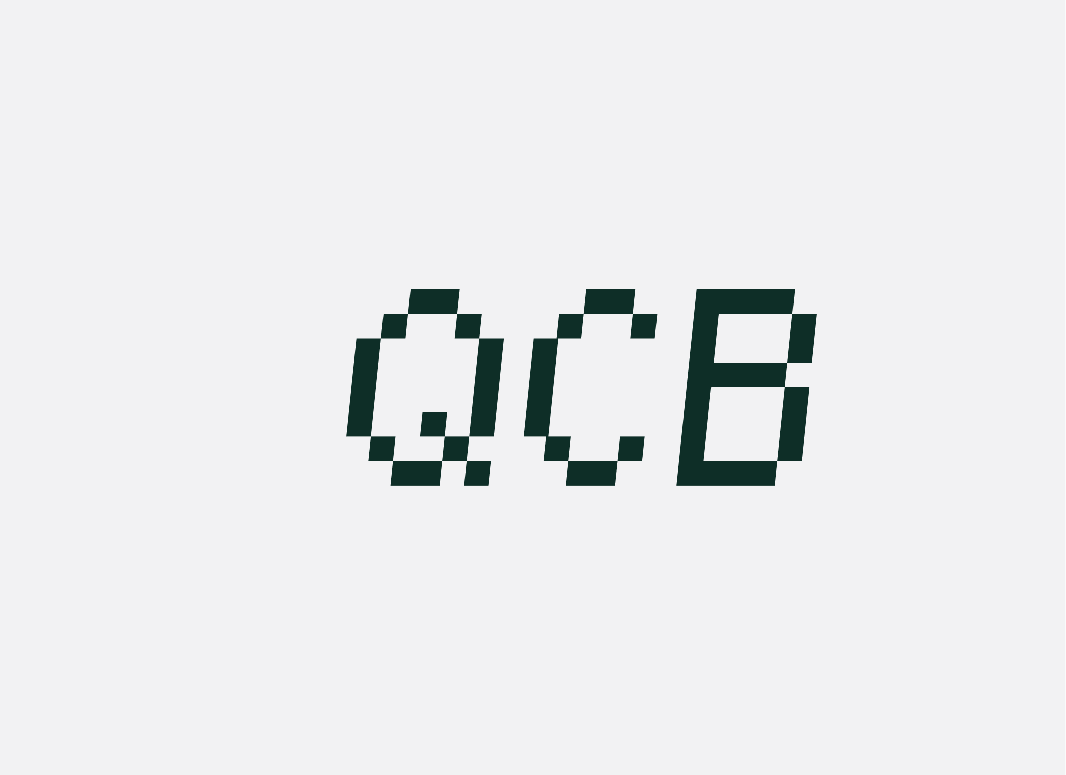
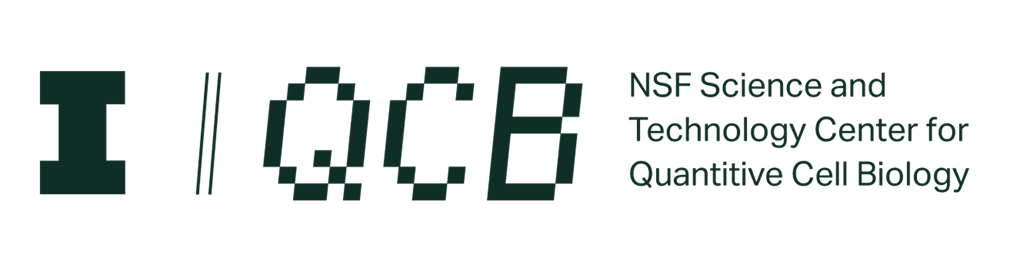
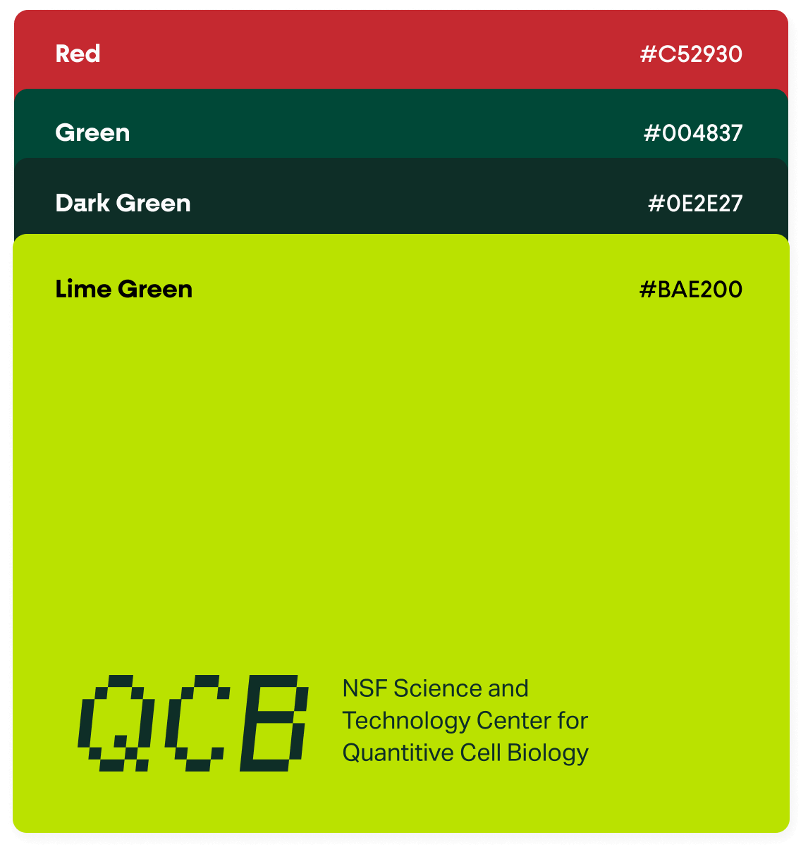
Before redesigning the website, we began by revisiting the center’s overall brand identity. The client wanted a distinct look—one that clearly separated them from the broader university and captured their unique vision and ambitions.
To achieve this we developed a new brand identity, including a new logo, fonts, and colors. The new logo was inspired by their signature Minecraft cell model, incorporating the center’s acronym in a way that felt unmistakably their own.
Proposed Concept
Proposed Concept
Our proposal process centered on presenting the new brand alongside early web wireframe concepts. This approach helped us identify key brand needs through the lens of potential website applications.
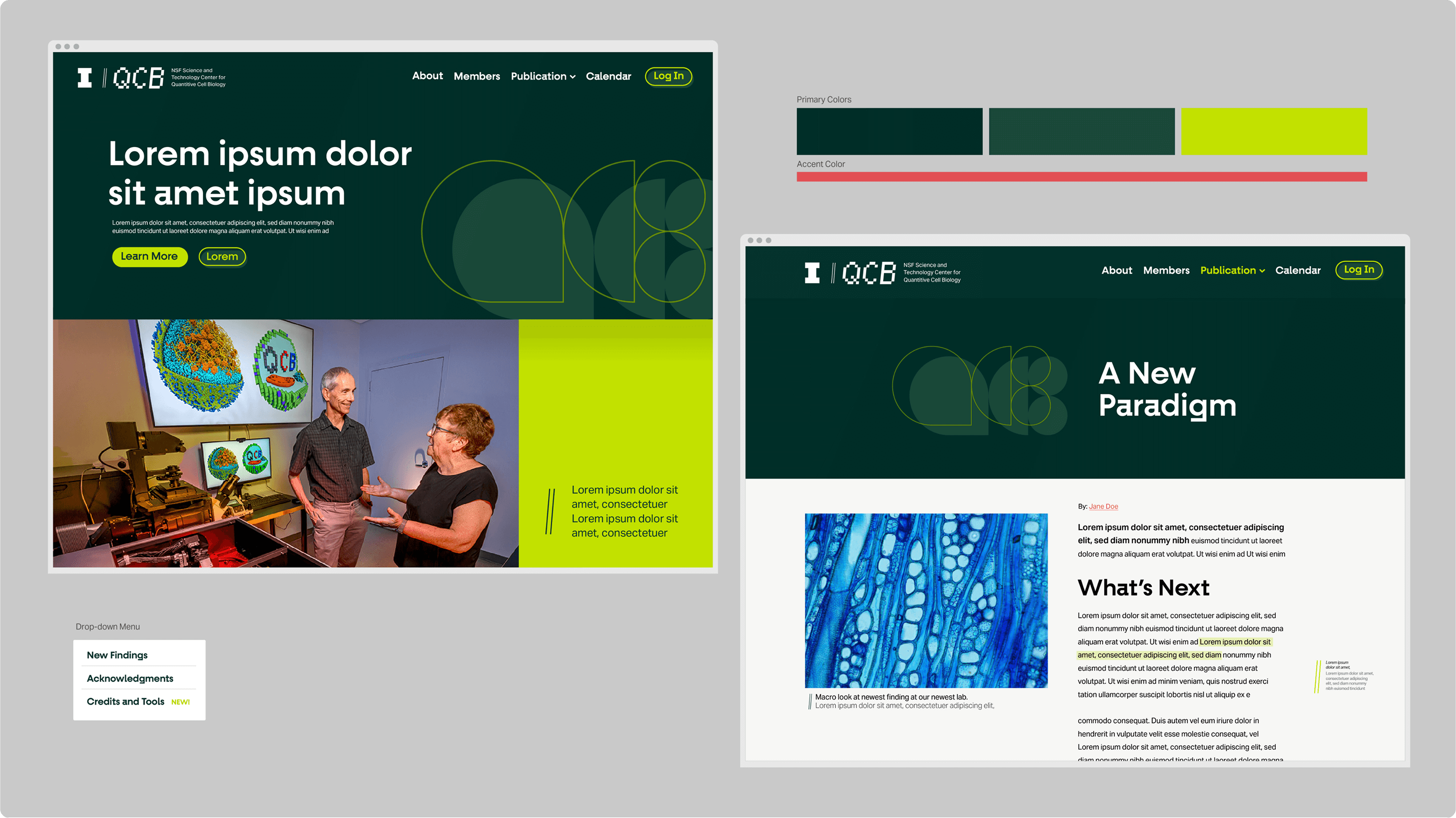
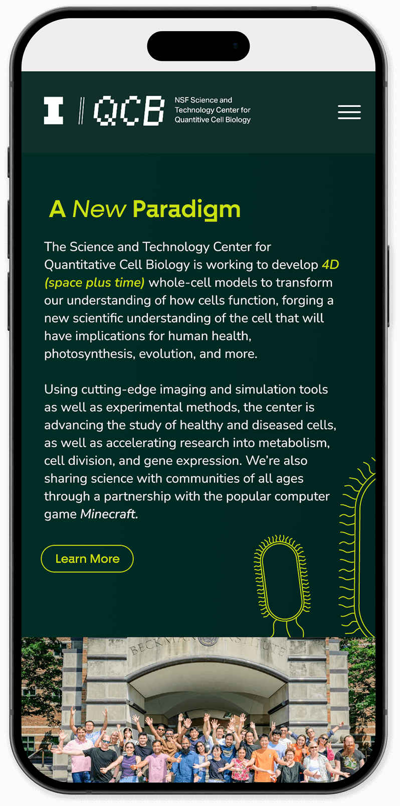
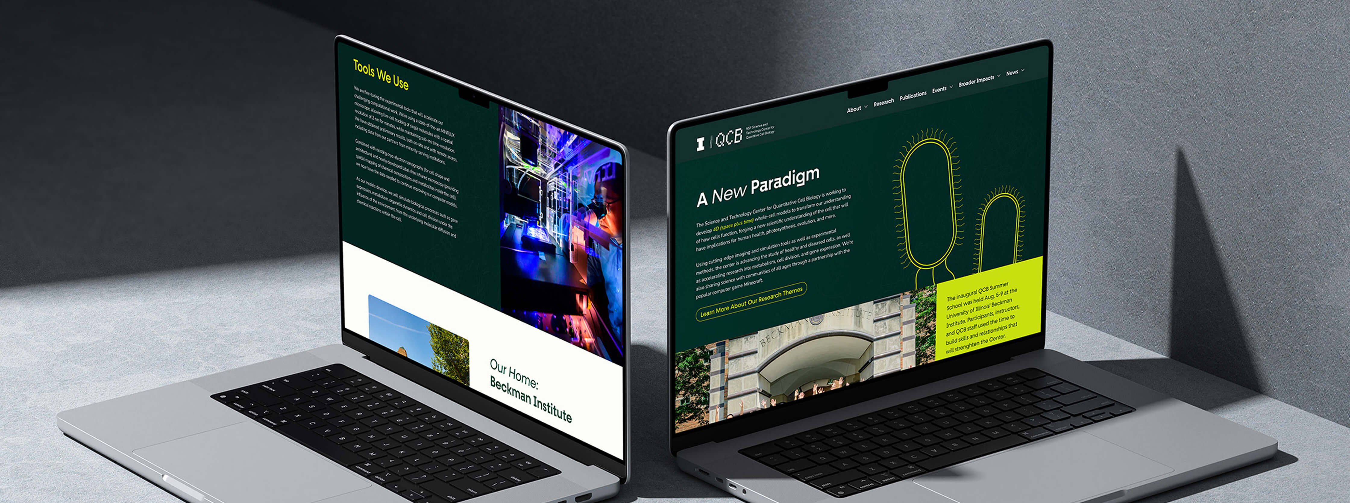
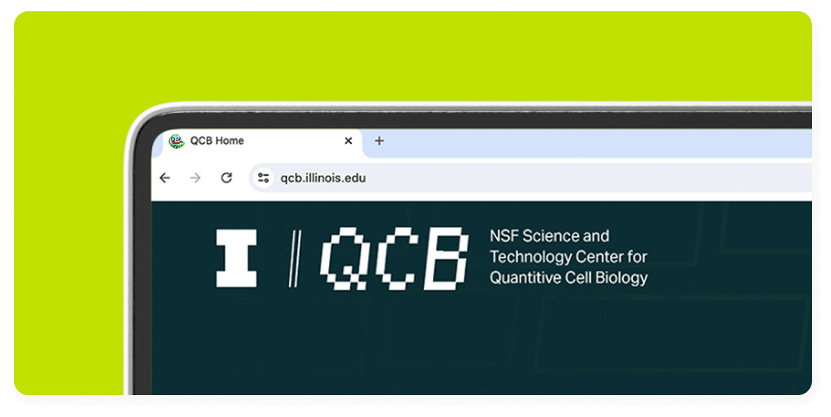
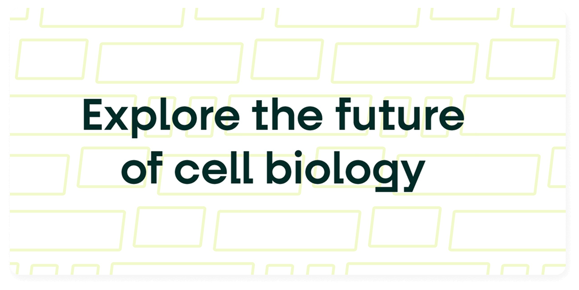
The New Site
The New Site
With a new identity in place, we translated the brand’s technical and forward-thinking spirit into the web design. Tasked with moving away from its University of Illinois origins, we reimagined each existing page to reflect the refreshed brand and extended those principles across newly developed sections. From contemporary layouts to dynamic patterns, the site captures the brand’s evolution in a visually engaging and future-facing way.